Scatter Diagram
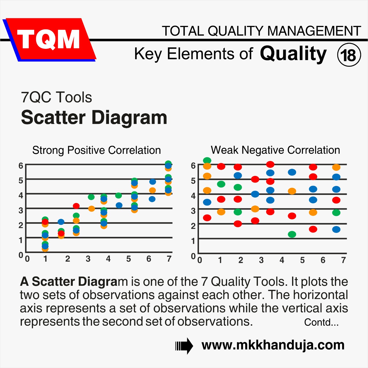
A Scatter diagram is one of the 7 Quality
Tools. It plots the two sets of observations against each other. The horizontal
axis represents a set of observations while the vertical axis represents the
second set of observations. Scatter Diagrams can be used to analyze the
correlations between variables visually. These two variables need to both be
continuous. They are an effective tool for exploring and visualizing data,
particularly when there needs to be a clear linear relationship. Additionally,
they can be used in conjunction with statistical tests like regression or
correlation analysis.
What Is Scatter Diagram Used For?
The scatter diagram is used for the
validation of two different variables. It is used for checking the trend with
respect to time. the scatter diagram is
used to confirm a hypothesis testing between two variables.
Types of correlation in scatter diagram
A correlation coefficient calculates the degree of relationship between two variables. The stronger the positive correlation between the variables, the higher the value. The correlation coefficient's value ranges from +1 to -1.
- Positive Correlation - When two variables increase in conjunction i.e. if one variable will increase the other will also increase in a defined proportion, this is called a positive correlation. The correlation coefficient value should be +1 in this case i.e. if one variable will increase the other one will decrease in defined proportion.
- Negative Correlation - When two variables fall in conjunction i.e. if one variable will increase the other one will decrease in defined proportion when there is a negative connection. In this correlation coefficient should have a value of -1.
- No Correlation - When there is no association between any two variables. The correlation coefficient value will be zero in the ideal scenario.
Features of A Scatter Diagram
The Scatter Diagram has a highly attractive graphic depiction that makes it simple to understand the data it displays.- A scatter plot can be created using any number of independent and dependent variables. This enables the comparison of a wide range of correlations between variables.
- Scatter plots give the analysis of the data visual support. One can do statistical analyses like correlation, regression, and grouping after making a scatter plot. The relationships between the variables can be better understood with the use of these analyses.
- Scatter Diagrams are easy to interpret and one can easily get an idea about the relationship between the variables. There is no need to do complex calculations.
- Scatter Plots and other visualization tools make it possible to share information with people without wasting their time with lengthy explanations.
Benefits of Scatter Diagram
- A Scatter diagram provides a visual and statistical means to test the strength of a potential relationship.
- It is a very good validation tool
- It is used for providing the relation between cause and effect
- The plotting of diagram is very simple.
Comments