Pareto Diagram
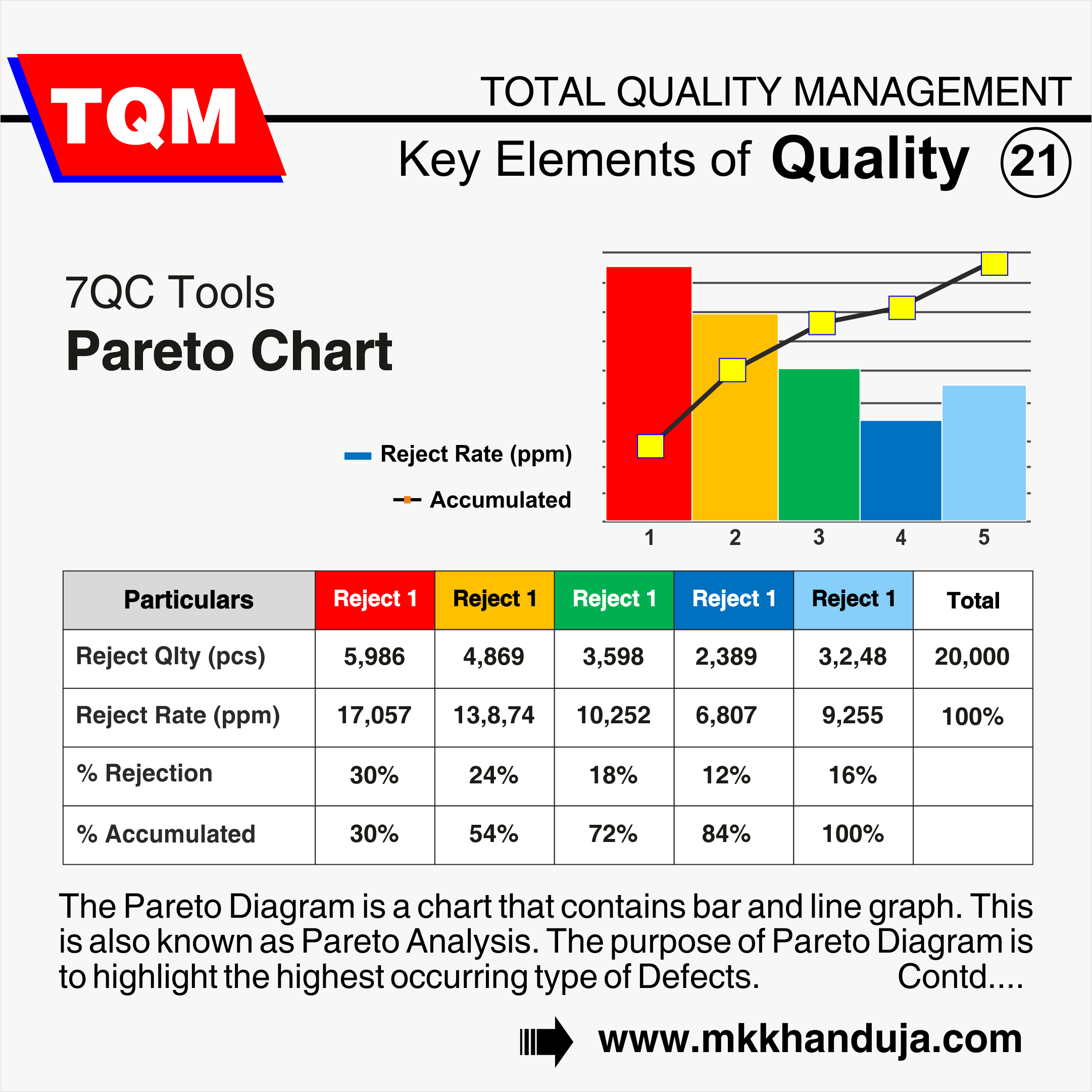
The Pareto Diagram is a chart that contains bar and line graph. This is also known as Pareto Analysis. The purpose of Pareto Diagram is to highlight the highest occurring type of Defects. The bar graph shows no of defects in descending order and the line graph shows cumulative percentage of defects.
The Pareto chart is often used to display data in the context of the 80/20 rule, which states that 80% of the effects come from 20% of the causes. In other words, the chart can be used to identify the important factors in a given situation that affect the critical output upto maximum extent.
There are a few different ways to construct a Pareto chart, but the most common method is to use a bar graph. The height of each bar represents the relative frequency of the corresponding value.
The Pareto chart is a valuable tool for decision-makers, as it can help to identify the most important factors to focus on in order to achieve the desired results.
When To Use A
Pareto Chart
- When examining information concerning the frequency of the issues or their root causes in a process.
- When there are several problems or reasons and you want to concentrate on the major.
- When analyzing broad causes by examining their particular elements.
Benefits Of Pareto Chart
- Helps to segregate the causes and problems
- Increases the problem solving skills
- Helps to visualize the problems properly
- Helps to focus on issues which having high impact after solving


Comments