7 TQM Quality Improvement Tools That Improvise Your Decision Making
Flowchart
The flowchart is a graphical representation of the process in as much detail as possible and aligning it in correct sequence. It shows all the steps and analysis, identifies the critical process control points and areas of further improvement.
Check Sheets
Check sheets categorically organize the data, and it shows how many times the particular value occurs. It helps the operators to spot the problem by offering the frequency of defect and its location.
Pareto Diagrams
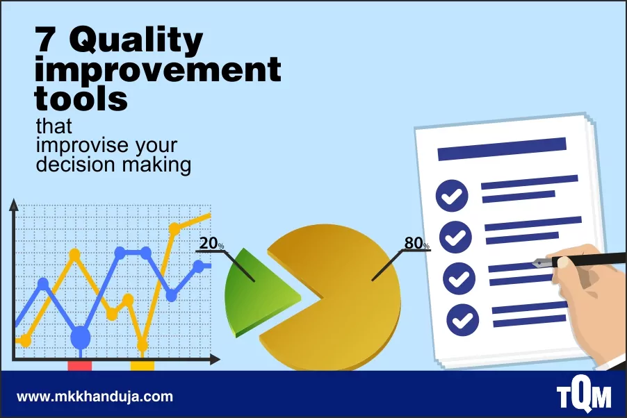
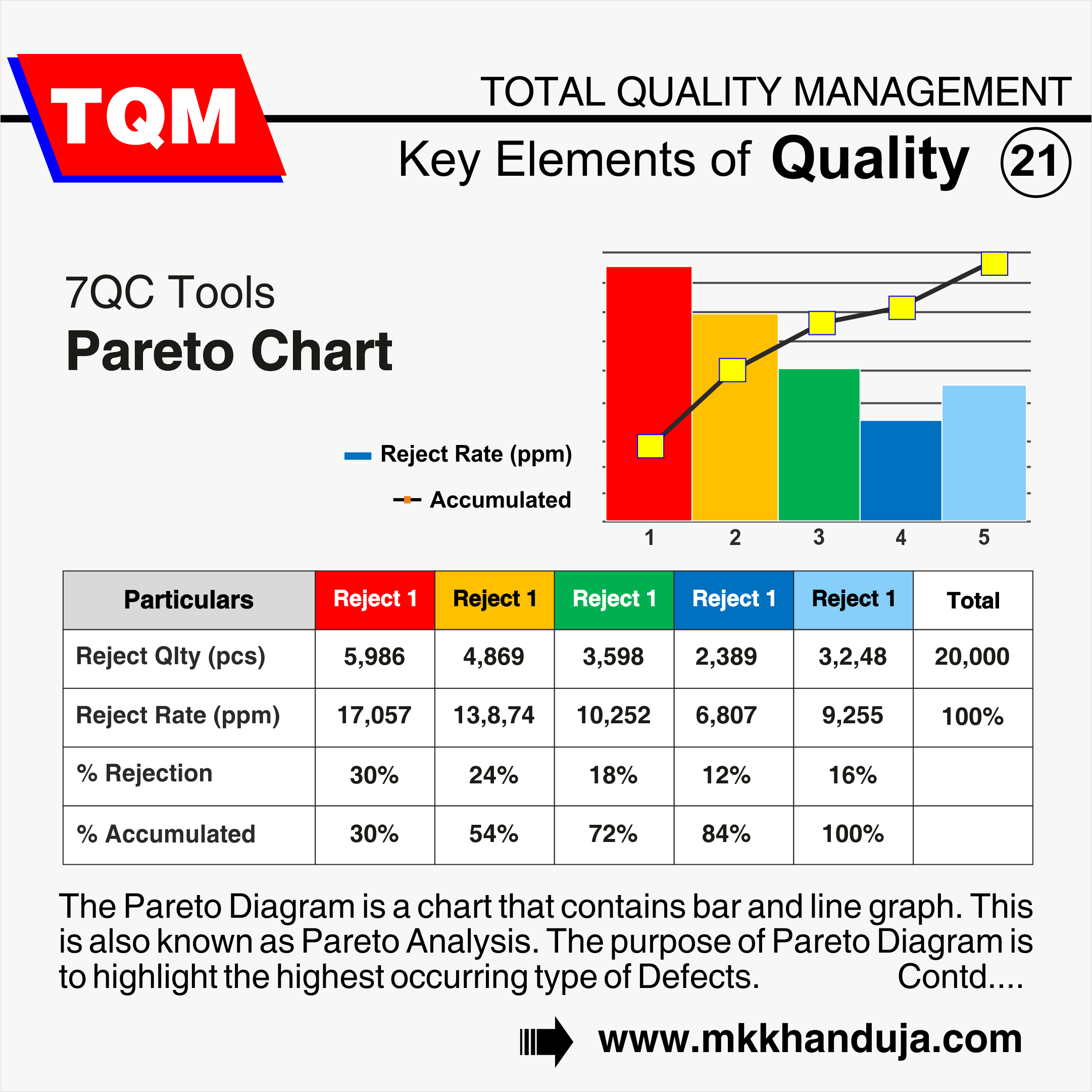
Pareto diagram works on the 80/20 rule, which says 80% of the quality problems occur due to 20% of the causes. Pareto analysis identifies the non-conformities and put the data in order. To create the chart, the operator needs to collect random data and re-categorize in order of frequency.
Cause and Effect Diagram
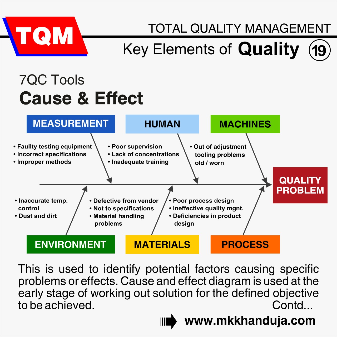
The cause-and-effect diagram, or fishbone chart, describes the relationship between variables. Here the undesirable outcome is an effect that is surrounded by its causes. The areas which form the bones are material, men, methods, measurement, machines, and design. The goal is to identify the most probable root cause of a problem for corrective action by eliminating the other causes one by one.
Histograms
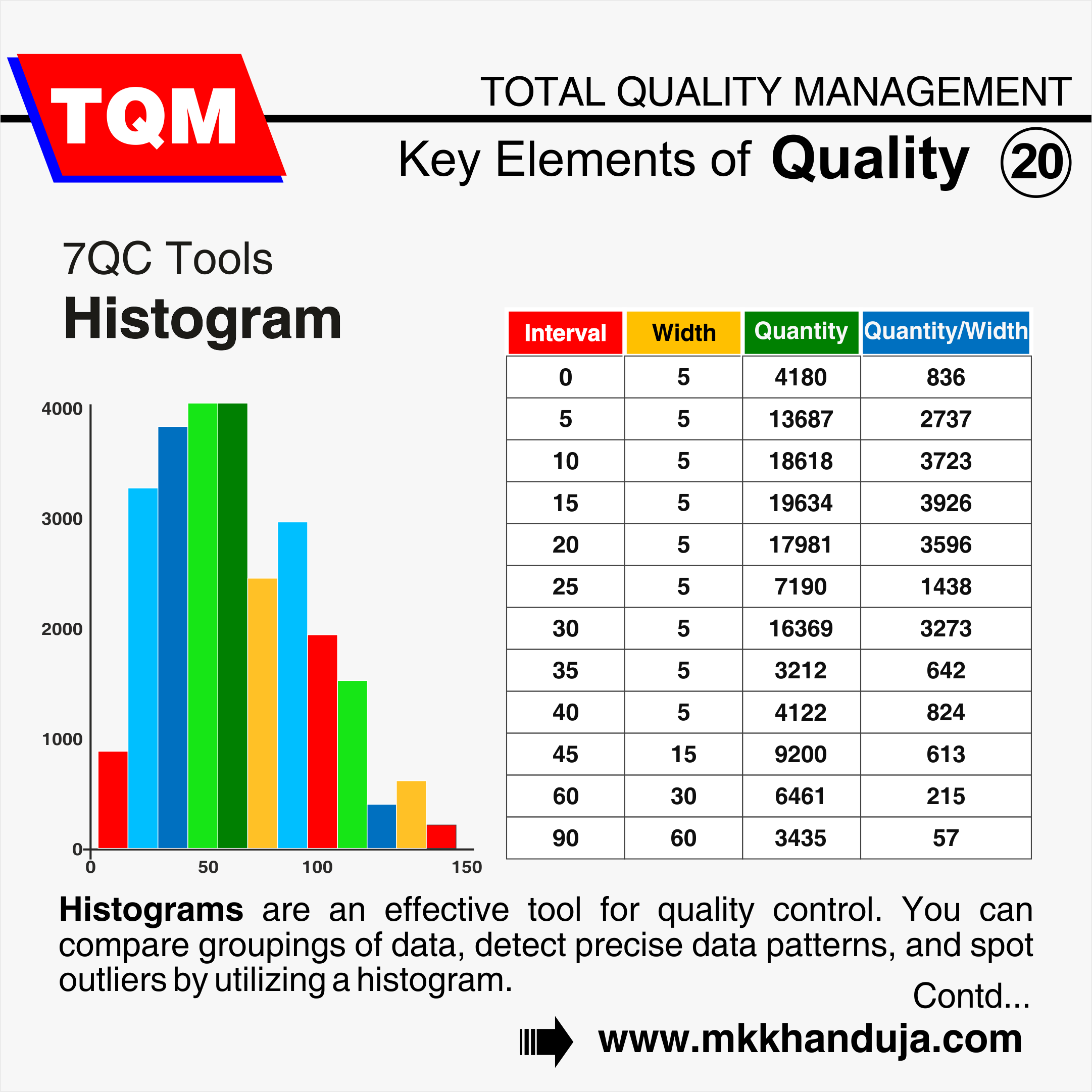
Histogram charts work best with a small amount of data and plot them in a frequency distribution table. While studying the process capabilities, a histogram can inform the specifications limits to show the portion of data that doesn't meet the specifications. After collecting the raw data, they are grouped in value and frequency, plotted in a graphical form.
Scatter Diagram
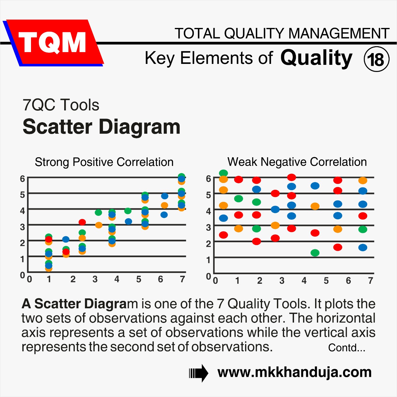
The scatter diagram or plot shows the relationship between two variables, which is further used for the cause-and-effect chart. A Scatter plot has the X axis and Y axis, representing the measurement of first and second variables.
Control Charts
The control charts are drawn with the upper control limit (UCL) and lower control limit (LCL) on either side with the process average at the centre. It shows that the collected data are within these limits, which were earlier determined through raw data calculations from trials. The processes are monitored over time, and they should be within the control limits; if not, then the causes a discovered, and corrective action needs to be taken.
By rigorously following and mastering these necessary seven tools, an organization can refine their quality improvement, improve organizations productivity, efficiency and operational excellence,
of course with optimum effort.

Comments